
August 4, 2026 · 6 min read
How Daylight Reveals the Character of Kitchen Stone
Daylight reveals more than the color of kitchen stone, bringing its veining, surface texture and edge profile into a shifting relationship with the surrounding architecture.
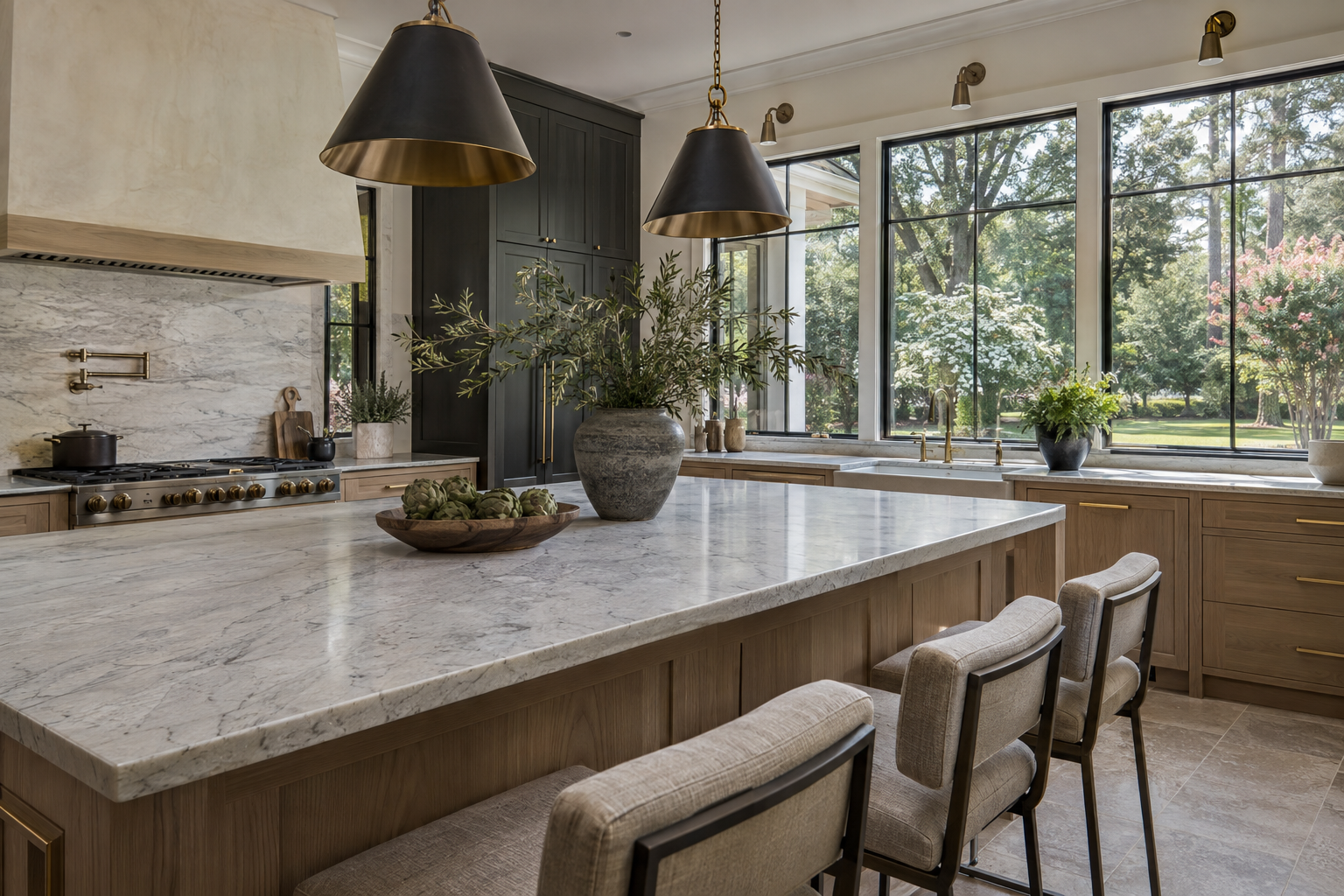
Natural stone kitchen countertops are often judged first by color, but daylight reveals a more complete picture. A pale slab can appear quiet from across the room and highly active at arm’s length. A dark surface may absorb the view in one direction and reflect a window in another. Veining, finish and edge detail determine how these changes register throughout the day.
In a principal kitchen, those qualities matter because stone occupies several fields of vision at once: the horizontal work surface, the island seen from an adjoining room, and sometimes a backsplash rising toward the windows. The most coherent compositions consider these views together, rather than treating the slab as an isolated decorative selection.
Reading Natural Stone Kitchen Countertops in Daylight
Light arriving across a surface behaves differently from light falling directly onto it. Low, lateral daylight makes small changes in texture more visible. Broad, diffuse light tends to soften contrast and reveal the overall color more evenly. Direct sun can create a bright reflection that temporarily obscures the pattern beneath it.
Window orientation influences this reading, though trees, roof overhangs and neighboring structures also matter. East-facing glass may introduce a concentrated morning highlight; west-facing glass can produce stronger afternoon contrast. North-facing light is often more consistent, while southern exposure changes considerably with season and shading. No orientation produces a single, fixed appearance.
In the Charlotte Piedmont, mature tree canopies can filter daylight into moving patches. Green foliage outside may also contribute a faint reflected cast to pale surfaces. This is one reason a stone sample viewed under a showroom fixture cannot fully describe the experience of a finished kitchen.
When looking at a residence, observe the stone from the main approach, from a seated position and from beside a window. The important question is not whether the material looks identical everywhere. It is whether its changes remain comfortable within the room’s palette and proportions.
Veining Establishes Direction and Scale
Veining gives stone a visual direction. Long, relatively continuous lines can carry the eye along an island, while branching or cloudlike formations create a less predictable rhythm. Neither is inherently more refined. Their effect depends on the size of the surface and the amount of other detail in the room.
A strongly figured island often reads best when the surrounding elements offer some restraint. Broad cabinet fronts, measured hardware and a quieter backsplash leave room for the stone’s movement. Where cabinetry has pronounced grain or closely spaced divisions, a slab with softer tonal variation may create a more settled composition.
The scale of the pattern deserves particular attention. A small sample may contain one dramatic vein without showing the large areas of open field around it. Conversely, an apparently restrained sample may belong to a slab with dense movement elsewhere. Whole-slab views explain the relationship between line, background and empty space far better than small chips.
Vein direction also becomes visible at transitions. On a waterfall island, a carefully planned turn can suggest continuity from the horizontal surface to the vertical panel. That effect depends on slab layout and cutting; it should not be assumed simply because the same stone appears on both planes. Natural variation remains visible even in thoughtfully arranged pieces.
Bookmatched slabs introduce another kind of order, pairing adjacent cuts to create a mirrored pattern. The result can be emphatic, especially on a tall backsplash. In a kitchen already organized around strong symmetry, that emphasis may feel appropriate. In a looser composition, a less formal arrangement may sit more comfortably.
Finish Changes Reflection, Not Just Texture
A polished finish produces a more defined reflection and often makes color and veining appear more saturated. In daylight, that clarity can be beautiful, but it can also place the reflected shape of a window prominently across the work surface. The stone and its reflection become part of the same visual composition.
A honed finish generally scatters light more softly. Veining remains legible without the same mirrorlike highlight, and pale stones can take on a chalkier appearance. Honing does not remove the material’s variation, nor does it make the surface immune to marks. It changes how light reveals them.
Textured finishes, often described as leathered or brushed, introduce a tactile quality that is particularly noticeable under grazing light. Their character varies with the stone and the finishing process. Some feel subtly undulating; others have more pronounced recesses. Those differences affect both the visual reading and the ease of wiping the surface clean.
Material identity matters as much as finish. Marble is vulnerable to etching from common kitchen acids, and honing does not prevent that reaction. Quartzite is generally more resistant to acid etching, but trade names alone do not establish composition or performance. Surface treatments and sealing requirements should be understood for the particular stone; a sealer does not make marble acid-proof.
The useful distinction is between appearance and behavior. A soft-looking surface is not necessarily delicate, and a glossy one is not necessarily more durable. Daylight helps reveal finish, but reliable material information is still needed to understand everyday care.
Edge Detail Gives the Slab Its Weight
An edge is a small part of the countertop’s area, yet it strongly influences the perceived mass of the whole installation. A modest eased edge keeps the outline direct while softening the arris—the sharp intersection of the top and side. In lateral light, that slight easing catches a narrow highlight.
A rounded profile spreads the highlight across a broader curve. It can make the same stone appear softer and more substantial. More articulated profiles introduce additional bands of light and shadow, bringing a decorative rhythm that should have a clear relationship to the cabinetry rather than operating independently of it.
A mitered edge can make a surface appear thicker by joining the top to a vertical strip. Its success depends on accurate alignment, restrained joint visibility and thoughtful handling of the pattern. Strong veins crossing the junction make discrepancies easier to notice, particularly when daylight strikes the face.
Apparent thickness should also be read against the island’s overall proportions. A deep edge may anchor a large volume, but on a smaller island it can become visually heavy. A slimmer profile leaves more emphasis on cabinet proportions and the space beneath an overhang. Neither approach needs ornament to feel resolved.
Let the Surrounding Materials Complete the Reading
Stone rarely establishes its character alone. White oak can bring warmth to a cool gray vein, while deep charcoal cabinetry sharpens the boundary of a pale slab. Muted brass contributes a warmer point of reflection; blackened metal provides a quieter, darker outline. Warm limestone nearby can connect the kitchen to a broader mineral palette without requiring an exact match.
The aim is not to eliminate contrast, but to decide where it belongs. If veining supplies the room’s strongest movement, the finish and edge can remain understated. If the stone is nearly uniform, a carefully proportioned edge or a soft grazing highlight may provide sufficient interest. Daylight makes these relationships legible without adding another decorative layer.
To explore these material relationships in context, view available residences from Peters Signature Homes or send an inquiry.
Related articles
Journal entries are general editorial writing. They are not offers, advice, or statements about any particular residence, price, availability or transaction. Imagery accompanying an entry is a conceptual visualization created for illustration and does not depict an actual property, and no residence, specification or figure described here has been verified as part of a listing.
Entity Relationship Disclosure
Peters Signature Homes, Inc. is a separate legal entity engaged in the development and sale of luxury speculative residences. Peters Signature Homes does not provide custom-homebuilding, renovation, or build-on-your-lot services.
References on this website to designers, builders, brokers, architects, engineers, consultants, subcontractors, suppliers, manufacturers, developers, lenders, communities, or other businesses identify their respective roles only and should not be interpreted as establishing a partnership, joint venture, agency relationship, guaranty, or assumption of another party's obligations unless expressly stated in a written agreement.
Each company or professional is responsible for its own services, representations, contractual obligations, licenses, insurance, warranties, acts, and omissions to the extent provided by applicable law and contract.
No company identified on this website should be considered a contracting party with a purchaser solely because it is referenced, credited, linked, or identified as having participated in the design, construction, marketing, sale, furnishing, financing, or presentation of a residence.
Company relationships · Legal disclosures · Property disclaimer