
September 11, 2026 · 6 min read
Vein, Surface and Silhouette in the Principal Kitchen
A stone surface is never separate from its light: veining establishes movement, finish controls reflection, and the edge gives the kitchen its sense of weight.
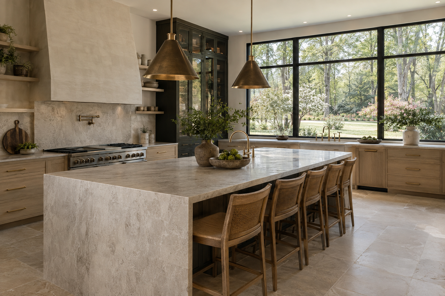
Natural stone kitchen countertops occupy an unusual position in a principal kitchen: they are working surfaces, but also broad architectural planes. Their character comes from more than color. Veining sets a direction, finish determines how light returns to the eye, and edge detail establishes apparent thickness. Daylight brings these decisions into focus, making the same slab feel quiet in the morning and more pronounced later in the day.
The useful question is not simply whether a stone is beautiful. It is how that stone behaves within the room. Window placement, cabinet proportions, adjacent materials and the direction of view all influence the result. A well-resolved kitchen allows these relationships to remain legible without making every surface compete for attention.
Natural Stone Kitchen Countertops as Architectural Planes
An island is often seen from several rooms before it is used. From a living area, its horizontal surface may appear as a narrow band, while the edge and end panels carry most of its visual presence. From a standing position beside it, the full field of the slab becomes visible. Those two readings can be quite different.
A pale stone with fine, dispersed markings may register as a continuous light plane from across the room. A slab with broad mineral bands can establish a stronger axis, drawing the eye toward a window or across the island. Neither approach is inherently more restrained. What matters is whether the pattern supports the geometry around it.
The amount of exposed stone also changes its effect. A surface framed by cabinetry reads differently from one that continues down an island end or rises behind a range. As the stone occupies more of the visual field, its pattern becomes a larger part of the architecture. Repetition should therefore feel deliberate rather than automatic.
Veining Creates Direction Before It Creates Drama
Veins can be linear, branching, cloudlike or tightly interwoven. Their scale matters as much as their contrast. Several thin gray lines in a pale ground may remain subtle across a large island, while one broad band can become the room’s dominant feature. Small samples rarely communicate that distinction well.
The direction of a vein can reinforce the length of an island or cut across it. A lengthwise movement tends to emphasize the run of the surface. A diagonal movement introduces a different energy, particularly where it meets a rectilinear cabinet layout. In a room already defined by strong floor grain or closely spaced window divisions, that diagonal deserves careful attention.
Seams and changes of plane reveal how the slab has been composed. When stone turns down an end panel, a continuous vein can help the two surfaces read as one folded form. Where the pattern shifts abruptly, the joint becomes more visible. Natural variation means continuity is not always possible, and a clear, intentional break can be preferable to a strained attempt at matching.
Bookmatched slabs create a mirrored relationship, often with a pronounced central figure. That effect can be compelling on a vertical surface, but it is not synonymous with good composition. A quieter arrangement may better serve a kitchen where the outlook, cabinetry or proportions should remain the primary focus.
Finish Changes the Way Daylight Returns
Polished stone produces relatively sharp reflections. A window may appear as a recognizable shape on the surface, and moving daylight can create bright highlights. Polishing often makes color and mineral contrast appear more saturated, although the effect varies with the stone. In strong light, reflection may temporarily obscure the pattern beneath it.
A honed finish diffuses reflection, so the surface generally reads with less glare. Veining can feel more integrated into the ground rather than sitting behind a reflective layer. Honed does not mean visually flat: low-angle light can still reveal subtle changes in texture, fabrication marks or the mineral structure of the stone.
Textured finishes, including those commonly described as leathered or brushed, introduce another kind of relief. Their appearance depends on the material and the finishing process; the labels do not describe one consistent texture. Daylight passing across the surface can reveal small peaks and recesses that are less apparent under diffuse overhead light.
Finish also affects how everyday marks are perceived. Acid-sensitive stones such as marble can etch when exposed to common kitchen acids. On a polished surface, that change may appear as a dull patch; on a honed surface, it can be less conspicuous without being absent. A sealer may help resist staining, but it does not prevent acid etching. Visual preference and tolerance for wear belong in the same conversation.
The Edge Gives the Surface Its Weight
An edge is a small detail with an outsized effect on proportion. A simple eased profile lets the slab read as a clean plane while softening the most vulnerable sharp arris. The slight radius can catch a narrow line of light, distinguishing the top from the vertical face without drawing an ornamental outline.
A built-up mitered edge creates the appearance of greater thickness. Its success depends on alignment, joint quality and the relationship between the stone’s pattern and the return. Daylight from the side can make discrepancies more evident, particularly when a bright vein crosses the joint. Greater apparent thickness can ground an island, but it can also make a modest form feel unnecessarily heavy.
A rounded profile distributes light across a broader curve. Rather than a crisp highlight and shadow, it produces a softer transition. More articulated profiles introduce additional bands of brightness and shade. These effects should be considered alongside cabinet door profiles and hardware, not as isolated decorative choices.
Even an understated edge changes with viewpoint. Against dark cabinetry, a pale stone edge can read as a strong horizontal stripe. Above light oak, the contrast may be gentler, allowing the grain and mineral pattern to share attention.
Read the Material Across the Day
A useful assessment begins with the whole room, then moves closer. Look first at the stone from the kitchen entrance and adjoining living space. Notice where the eye travels, whether the island feels appropriately weighted, and whether reflected windows distract from the surface itself.
Then consider the material in both broad, diffuse light and light arriving at a shallow angle. The first reveals overall color relationships; the second exposes texture, edge transitions and surface irregularities. Artificial lighting adds another reading after sunset, but it cannot fully substitute for these daylight conditions.
Adjacent materials complete the assessment. Warm white oak can bring out beige undertones; deep charcoal can sharpen the apparent brightness of a pale slab. Muted brass and blackened metal introduce smaller points of contrast. The strongest composition gives each material a clear role, leaving enough visual space for the stone’s natural variation to remain convincing.
To explore these relationships in a complete residence, view available residences from Peters Signature Homes or send an inquiry.
Related articles
Journal entries are general editorial writing. They are not offers, advice, or statements about any particular residence, price, availability or transaction. Imagery accompanying an entry is a conceptual visualization created for illustration and does not depict an actual property, and no residence, specification or figure described here has been verified as part of a listing.
Entity Relationship Disclosure
Peters Signature Homes, Inc. is a separate legal entity engaged in the development and sale of luxury speculative residences. Peters Signature Homes does not provide custom-homebuilding, renovation, or build-on-your-lot services.
References on this website to designers, builders, brokers, architects, engineers, consultants, subcontractors, suppliers, manufacturers, developers, lenders, communities, or other businesses identify their respective roles only and should not be interpreted as establishing a partnership, joint venture, agency relationship, guaranty, or assumption of another party's obligations unless expressly stated in a written agreement.
Each company or professional is responsible for its own services, representations, contractual obligations, licenses, insurance, warranties, acts, and omissions to the extent provided by applicable law and contract.
No company identified on this website should be considered a contracting party with a purchaser solely because it is referenced, credited, linked, or identified as having participated in the design, construction, marketing, sale, furnishing, financing, or presentation of a residence.
Company relationships · Legal disclosures · Property disclaimer