
August 2, 2026 · 6 min read
The Small Metal Decisions That Give a House Away
Door levers, cabinet pulls and switch plates reveal a house’s design discipline through their proportions, placement and the way their finishes relate to surrounding materials.
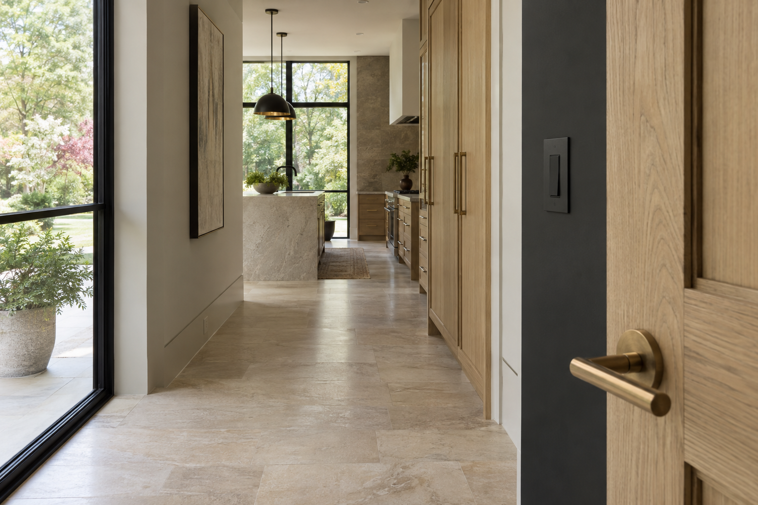
Architectural hardware is often where a house reveals its age most clearly. Not because brass belongs to one decade or black metal to another, but because small fittings tend to carry the strongest stylistic signals. A sharply angular lever, an oversized cabinet pull or a bright plate against quiet plaster can make an otherwise restrained room feel tied to a particular moment.
These details also reveal something more useful than age: whether the house was considered as a whole. The eye notices repetition, but the hand notices weight, edges and movement. Good metal decisions work at both scales. They belong to the architecture without asking every hinge, latch and switch to become a feature.
Architectural hardware begins with proportion
Finish attracts attention first, yet proportion usually matters more. A lever with a thick neck and a short handle reads differently from a slim, elongated one, even when both have the same surface treatment. The size of the rose behind the lever changes the balance again. On a narrow door stile, a broad circular rose can look crowded; on a substantial door, a very small fitting may seem underpowered.
The same principle applies to cabinetry. Pull length should relate to the width of the drawer, the geometry of the fronts and the intended grip. Repeating one pull size across every cabinet may simplify a schedule, but it does not necessarily create visual order. A wide drawer and a small upper door have different physical demands.
Restraint is not synonymous with thinness. A generous grip can feel appropriate on a heavy pantry door, while a delicate knob may suit a shallow furniture-like cabinet. What dates a room is often the repeated use of an emphatic shape without regard for its setting. Better selections take their scale from the object they serve.
Finish is a relationship, not a color chart
Metal samples are difficult to judge in isolation. Muted brass can look soft beside white oak and unexpectedly yellow against a cool white surface. Blackened metal may feel grounded next to warm limestone but severe against pale, highly reflective cabinetry. The surrounding material changes what the eye perceives.
Sheen matters as much as hue. A polished surface reflects windows, lamps and movement, making a small fitting more visually active. Brushed and satin surfaces scatter light, though those labels are not standardized across manufacturers. Two products described as satin brass can differ noticeably in warmth, texture and reflectivity. Physical samples viewed together are more useful than matching finish names.
Natural light adds another variable. In the Charlotte Piedmont, humid daylight filtered through mature hardwoods can soften contrast, while direct afternoon sun can reveal every brush mark and fingerprint. A finish should be considered under both daylight and the room’s evening lighting. A sample that looks balanced at noon may turn conspicuously warm beneath a lamp.
Consistency does not require one metal everywhere. It requires a legible relationship. Door hardware might establish a steady background while cabinet fittings respond to oak, painted surfaces or stone. Decorative lighting can occupy another register. The difficulty comes when every category introduces a competing tone and sheen, leaving no clear visual priority.
Switch plates belong to the wall
A switch plate is a frame around a working device. Because it sits near eye level and is encountered repeatedly, its relationship to the wall deserves the same care as a door fitting. Bright white plastic against a deep charcoal wall creates a small, high-contrast rectangle. Sometimes that contrast is intentional; often it is simply unconsidered.
The plate and the switch should be evaluated together. A metal cover around an unrelated white device can draw more attention than a coordinated, understated assembly. Conversely, making every plate metallic can turn ordinary controls into decorative punctuation. The aim is not to make the smallest component luxurious in isolation, but to give it an appropriate presence.
Profile and fit are especially revealing. A low-profile plate with even edges looks settled against a flat wall. Gaps, uneven seating and visible wall irregularities can undermine an expensive finish. Screwless plates offer one kind of quietness; exposed screws can be equally convincing when they suit the architecture and are neatly aligned.
Placement completes the composition. Controls should sit comfortably within the available wall area rather than appearing squeezed between a casing and a corner. Multiple controls benefit from a coherent arrangement, with necessary functions easy to identify. Visual calm should never depend on making a room difficult to use. Any finish treatment must also respect the device manufacturer’s instructions; painting working components is not a substitute for selecting a suitable assembly.
The details that hands understand
Photographs flatten the qualities that make hardware satisfying. They cannot convey whether a lever has an uncomfortable underside, whether a knob allows enough finger clearance or whether a pull catches against the hand. These are not secondary considerations. A fitting is encountered through use long after its finish stops attracting notice.
Examine the transitions. Where does the lever meet its stem? Are corners eased where fingers wrap around them? Does the edge of a recessed pull provide a comfortable purchase? A visually minimal shape may be awkward if the grip is shallow, particularly on a heavier drawer. Simplicity should describe the experience as well as the appearance.
Operation also matters. A door fitting should feel appropriate to the door and its mechanism, without loose movement or distracting resistance. Cabinet hardware depends on secure attachment and accurate alignment. Even well-made pieces look unresolved when adjacent pulls sit at slightly different heights or when the spacing changes without a reason.
These qualities distinguish craft from styling. A fashionable finish can be applied to a poorly resolved object. A quieter piece, properly selected and installed, can make the daily experience of a room feel considerably more composed.
Let age appear as wear, not confusion
No metal finish sits outside time. Unlacquered brass can darken and develop varied markings through handling. Coated finishes behave differently, and care requirements depend on the specific product. Neither change nor uniformity is inherently better. The important question is whether the expected surface behavior belongs to the room and to its intended use.
A house feels dated when its details seem to imitate a moment more strongly than they support the architecture. Avoiding that effect does not mean removing character. It means choosing a few clear relationships: a comfortable lever, a well-scaled pull, a plate that respects the wall, and finishes that make sense beside the materials they touch.
For Peters Signature Homes, Emerald & Oak Design is the exclusive design firm. Looking closely at small fittings is one way to read the broader interior direction of a complete residence—not merely its palette, but the relationship between appearance and everyday use.
View available residences from Peters Signature Homes, or send an inquiry to learn more.
Related articles
Journal entries are general editorial writing. They are not offers, advice, or statements about any particular residence, price, availability or transaction. Imagery accompanying an entry is a conceptual visualization created for illustration and does not depict an actual property, and no residence, specification or figure described here has been verified as part of a listing.
Entity Relationship Disclosure
Peters Signature Homes, Inc. is a separate legal entity engaged in the development and sale of luxury speculative residences. Peters Signature Homes does not provide custom-homebuilding, renovation, or build-on-your-lot services.
References on this website to designers, builders, brokers, architects, engineers, consultants, subcontractors, suppliers, manufacturers, developers, lenders, communities, or other businesses identify their respective roles only and should not be interpreted as establishing a partnership, joint venture, agency relationship, guaranty, or assumption of another party's obligations unless expressly stated in a written agreement.
Each company or professional is responsible for its own services, representations, contractual obligations, licenses, insurance, warranties, acts, and omissions to the extent provided by applicable law and contract.
No company identified on this website should be considered a contracting party with a purchaser solely because it is referenced, credited, linked, or identified as having participated in the design, construction, marketing, sale, furnishing, financing, or presentation of a residence.
Company relationships · Legal disclosures · Property disclaimer