
October 5, 2026 · 5 min read
The Small Metal Details That Give Rooms Their Age
Door levers, cabinet pulls and switch plates carry more visual weight than their size suggests, revealing whether an interior follows a passing preference or a lasting architectural language.
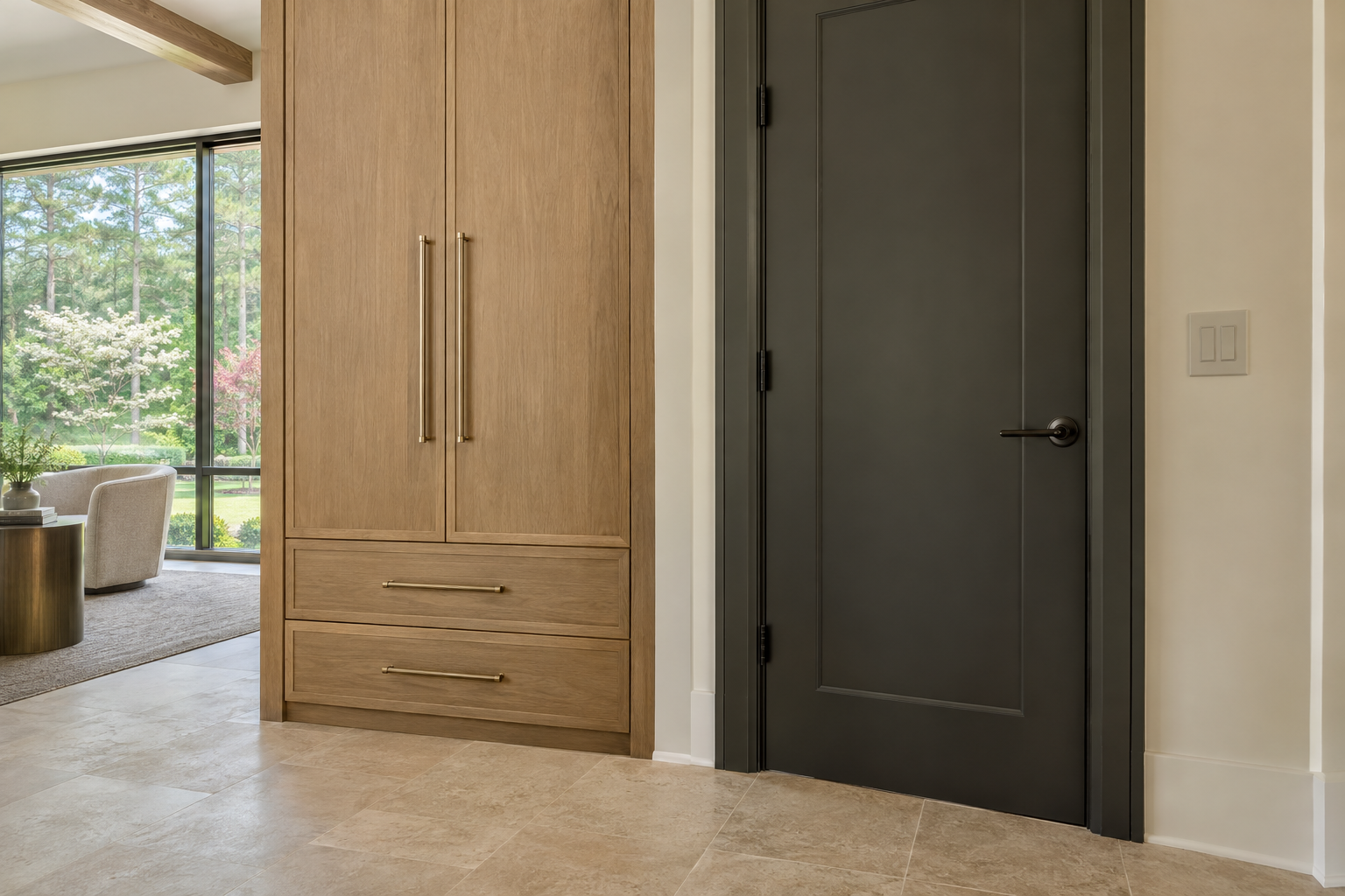
Architectural hardware is among the smallest elements in a residence, yet it can be one of the clearest indicators of when a room was designed. A lever profile, a cabinet pull or the sheen of a switch plate can attach an otherwise measured interior to a particular moment. The issue is rarely that a metal has gone out of favor. More often, the finish, shape and frequency of its use have become more noticeable than the architecture they were meant to support.
These details also occupy an unusually intimate position. They sit at eye level, meet the hand and repeat from room to room. Their success depends as much on touch and placement as on appearance. Read together, they can give a residence continuity without making every surface look alike.
Architectural Hardware Begins With Proportion
Before considering brass, nickel or blackened metal, consider the outline. A slender lever on a broad door can feel under-scaled; a heavy decorative rose can overwhelm narrow stile-and-rail construction. Neither condition is corrected by choosing a more fashionable finish.
Door hardware should make sense against the door's thickness, panel arrangement and casing. The rose—the plate behind a knob or lever—deserves particular attention. A compact round rose may recede, while an elongated backplate makes a more deliberate architectural statement. Both can work, but they establish different expectations for the surrounding detail.
Cabinet hardware follows a similar logic. Pull length should relate to drawer width and the visual weight of the cabinet front. One size used everywhere may simplify repetition, yet it can leave wide drawers looking tentative and small drawers crowded. A limited family of related sizes often produces a more composed result.
Restraint is not synonymous with thinness. A substantial pull can be quiet when its section, projection and placement feel resolved. Conversely, a very fine pull can become conspicuous if its proportions conflict with the cabinetry. The useful question is whether the hardware belongs to the object it operates.
Finish Is More Than a Color Name
Finish labels are imperfect guides. Two products described as brushed brass can differ noticeably in warmth, grain and reflectivity. Satin nickel may read soft and gray in one collection and bright beside it in another. The discrepancy becomes more visible when the pieces share a sightline or occupy the same cabinet elevation.
Sheen often matters as much as hue. A polished surface catches the room in miniature, reflecting windows, light fixtures and movement. A brushed surface scatters those reflections. Dark finishes can either recede into shadow or create a strong graphic rhythm against pale cabinetry, depending on contrast and scale.
The substrate and protective treatment also affect how a piece wears. Unlacquered brass develops patina through handling and exposure; lacquered brass is intended to retain a more consistent surface until that coating wears or is damaged. Plated and coated finishes have their own care requirements. Appearance alone does not establish how any particular product will behave.
Patina and damage should not be confused. A finish intended to change can gain character through uneven contact. A coating that chips at the edges presents a different condition. Thoughtful material selection starts with understanding which kind of change is expected, then deciding whether that change suits the room.
Switch Plates Belong to the Wall
Switch plates rarely deserve to be a focal point. Their job is to finish a necessary opening cleanly, with a profile and color that respect the surrounding surface. On a painted wall, a low-profile plate close to the wall color can reduce interruption. On stone or wood, the decision requires more attention because the plate interrupts an existing pattern or grain.
The device matters as much as its cover. A carefully chosen plate cannot fully quiet a mismatched switch, conspicuous dimmer or inconsistent arrangement of controls. Device color, plate edge and the number of controls grouped together all contribute to the final appearance.
Placement has an architectural dimension, although electrical requirements and practical access remain essential. A bank of switches squeezed against casing looks unresolved. A plate cutting awkwardly across a tile joint introduces a small but persistent visual distraction. Coordinating these relationships early allows technical necessities to sit more comfortably within the wall composition.
Metal plates are not inherently more refined than other materials. Their reflectivity can draw attention to controls that would otherwise disappear. Likewise, a screwless cover is not automatically unobtrusive if it projects prominently or has a contrasting perimeter. The best detail is the one that makes sense at normal viewing distance, not merely in a close photograph.
Mixed Metals Need a Clear Hierarchy
A coherent interior does not require every metal to match. It does require a reason for differences. Door hardware, cabinetry, plumbing fixtures and decorative lighting perform different roles, and those roles can support a deliberate division of finishes.
For example, muted brass cabinet pulls may sit comfortably with a nickel faucet when each has a distinct territory. A blackened metal window frame can establish a background rhythm without requiring every hinge and knob to turn black. The difficulty begins when several nearly matching finishes compete within one small area.
Sightlines offer a useful test. From the kitchen, consider the pantry door lever, nearby cabinet pulls and visible lighting together. From a hall, consider hinges, levers and control plates as a sequence. A finish need not repeat in every room, but transitions should feel legible rather than accidental.
Matching a manufacturer's finish name across unrelated products is less reliable than comparing physical samples in the intended light. Warm daylight, shaded walls and evening illumination can reveal differences that a screen conceals. A limited palette with clear roles usually feels more settled than either indiscriminate mixing or an insistence on identical metal everywhere.
The Hand Reveals What the Eye Misses
Hardware is a working part of the interior. A beautiful lever can disappoint if its return crowds the fingers. A cabinet pull may look elegant while providing too little clearance for a comfortable grip. Sharp edges, loose movement and awkward projection become more apparent through daily use than through photographs.
At a residence viewing, operate a few representative doors and drawers. Notice whether the lever feels secure, whether a pull accommodates the hand and whether adjacent hardware interferes when doors open. Weight alone is not proof of quality; smooth operation, sound attachment and well-finished edges tell a more useful story.
No finish or silhouette can place a house entirely outside its time. The more durable approach is to avoid asking small metal details to carry the whole identity of a room. Proportion, a considered finish hierarchy and comfortable operation allow them to support the architecture rather than announce a trend.
Peters Signature Homes offers complete residences for purchase, with Emerald & Oak Design as its separate, exclusive design firm. View available residences or send an inquiry to explore the design direction in more detail.
Related articles
Journal entries are general editorial writing. They are not offers, advice, or statements about any particular residence, price, availability or transaction. Imagery accompanying an entry is a conceptual visualization created for illustration and does not depict an actual property, and no residence, specification or figure described here has been verified as part of a listing.
Entity Relationship Disclosure
Peters Signature Homes, Inc. is a separate legal entity engaged in the development and sale of luxury speculative residences. Peters Signature Homes does not provide custom-homebuilding, renovation, or build-on-your-lot services.
References on this website to designers, builders, brokers, architects, engineers, consultants, subcontractors, suppliers, manufacturers, developers, lenders, communities, or other businesses identify their respective roles only and should not be interpreted as establishing a partnership, joint venture, agency relationship, guaranty, or assumption of another party's obligations unless expressly stated in a written agreement.
Each company or professional is responsible for its own services, representations, contractual obligations, licenses, insurance, warranties, acts, and omissions to the extent provided by applicable law and contract.
No company identified on this website should be considered a contracting party with a purchaser solely because it is referenced, credited, linked, or identified as having participated in the design, construction, marketing, sale, furnishing, financing, or presentation of a residence.
Company relationships · Legal disclosures · Property disclaimer