
August 23, 2026 · 6 min read
The Material Thread That Connects Room to Room
A coherent palette gives every room its own character while connecting stone, wood, metal, and paint through a disciplined approach to undertone, proportion, and light.
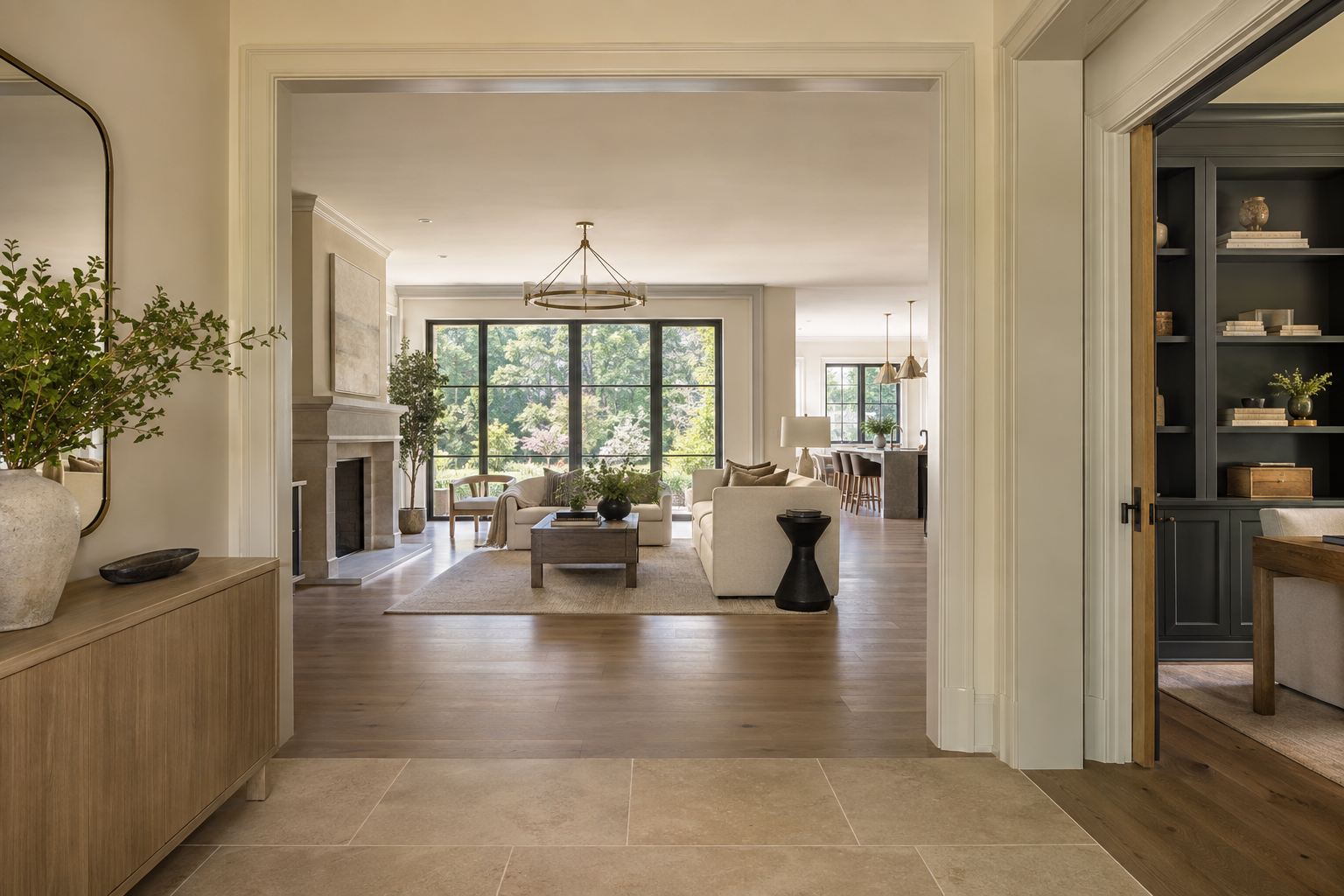
A whole-home color palette is not a collection of matching finishes. It is a system of relationships: the temperature of a wall beside stone, the depth of a door against plaster, the grain of cabinetry seen beyond an opening. Those relationships need to remain convincing as a person moves through the residence. A successful palette allows rooms to differ without making each threshold feel like the beginning of another house.
This requires more than choosing attractive materials individually. Each selection has a role, a visual weight, and a relationship to daylight. The work lies in deciding what repeats, what recedes, and where a deliberate change gives a room its particular character.
Establishing a Whole-Home Color Palette
The most useful starting point is a small family of foundational materials. These usually occupy the largest surfaces or appear along the longest sightlines: flooring, principal wall colors, prominent stone, and major cabinetry. Because they are encountered repeatedly, they establish the visual expectations against which smaller choices will be read.
A foundation of white oak and warm limestone, for example, does not require every subsequent surface to be beige. It establishes a range of warmth, texture, and contrast. Deep charcoal can sit comfortably within that range, while an apparently neutral white with a strong blue cast may feel disconnected. The issue is not whether a color is light or dark, but how it relates to its neighbors.
Hierarchy matters as much as selection. One material might provide the continuous ground, another the principal variation, and a third the sharper accent. When every surface competes for attention through pronounced grain, veining, or contrast, the palette loses its order. A quieter background gives expressive materials enough space to be understood.
Undertone Is More Important Than the Color Name
Labels such as cream, taupe, gray, and natural oak are too broad to establish compatibility. Two creams may diverge sharply when one leans pink and the other yellow. A gray stone may contain green undertones that become visible only beside a warm wall. These differences are not necessarily problems, but they need to be intentional.
Wood adds another layer because it is not a uniform color. Species, grain, surface preparation, and finish influence its appearance. A clear coating can deepen warmth, while a pigmented finish can soften some color variation without eliminating it. Stone likewise contains a field color, secondary tones, and markings that may read differently at close range and across a room.
Materials should therefore be considered together, not approved as isolated samples. A useful review places flooring, stone, cabinetry, paint, and metal in the relationships they will actually occupy. Horizontal samples belong flat; wall finishes belong upright. Orientation changes reflected light, and a combination that looks balanced on a table may behave differently when placed vertically beside a window.
Repeat Relationships Rather Than Entire Rooms
Continuity does not require the kitchen, study, and primary bath to share identical finishes. More often, it comes from repeating a relationship between finishes. Pale mineral surfaces against warm timber might recur throughout the residence, even as the mineral changes from limestone to porcelain and the timber shifts from a broad floor plane to a smaller cabinet front.
A metal finish can provide a similar thread. Muted brass might appear at selected points of touch or illumination, while blackened metal supplies a darker architectural line. Their distribution should feel deliberate rather than evenly scattered. Repetition becomes useful when it reinforces a role, not simply when the same finish appears in every room.
The proportion can change as well. In a bright living room, charcoal may be limited to a fireplace detail or narrow frame. In a study, it could become the dominant wall or cabinetry color, with oak and pale textiles carrying the lighter notes. The ingredients remain related, but their balance gives each room a distinct atmosphere.
Sightlines Make Transitions Part of the Palette
Rooms are rarely experienced in isolation. From an entry, the eye may pass across a hall, through a living area, and toward the kitchen. Each visible surface contributes to a single composition, even when those surfaces belong to different spaces. Palette decisions need to account for these overlapping views.
A change in flooring is especially consequential because it interrupts a large, continuous plane. Where a different material is appropriate, its meeting point should align with a meaningful architectural boundary: a doorway, a defined room edge, or a change in use. An arbitrary seam can make compatible materials feel unresolved.
Door leaves, casings, baseboards, and reveals also mediate between rooms. Their color determines whether an opening reads as a quiet passage or a pronounced frame. A darker room beyond a pale hall can feel entirely coherent when the threshold is precisely handled and one familiar material continues through the view. Contrast benefits from a clear boundary and something recognizable on either side.
Light and Sheen Change the Same Material
A palette is never static. In Charlotte's Piedmont setting, daylight filtered through mature trees can produce softer, shifting illumination, while an exposed window may deliver stronger contrast. The same wall color can appear restrained in one room and more saturated in another. This is a reason to test selections in place rather than expect a sample to predict every condition.
Sheen changes the reading further. Honed stone diffuses light differently from polished stone. Brushed metal has a different presence from a reflective finish, even when both share a similar underlying color. A glossy surface may register as a bright interruption; a low-sheen surface may let its color and texture remain more legible.
Evening lighting deserves the same review. Lamp color temperature and color rendering affect how wood, paint, and stone appear together. The objective is not to make every surface look identical from morning to night. It is to preserve the intended relationships as the source and direction of light change.
Give Variation a Clear Purpose
A coherent residence needs moments of difference. A powder room can carry a more concentrated color, a bedroom can soften the contrast, and a dining room can introduce a more tactile wall surface. These shifts feel connected when they retain something from the larger palette: an undertone, a timber, a metal, or a familiar balance of light and dark.
The final discipline is restraint. Adding another stone or finish should answer a spatial need rather than merely introduce novelty. Peters Signature Homes designs and builds complete residences for purchase, with Emerald & Oak Design as its separate, exclusive design firm. A whole-residence perspective allows material choices to be considered as parts of one architectural experience, rather than as unrelated room selections.
To explore that experience further, view available residences from Peters Signature Homes or send an inquiry.
Related articles
Journal entries are general editorial writing. They are not offers, advice, or statements about any particular residence, price, availability or transaction. Imagery accompanying an entry is a conceptual visualization created for illustration and does not depict an actual property, and no residence, specification or figure described here has been verified as part of a listing.
Entity Relationship Disclosure
Peters Signature Homes, Inc. is a separate legal entity engaged in the development and sale of luxury speculative residences. Peters Signature Homes does not provide custom-homebuilding, renovation, or build-on-your-lot services.
References on this website to designers, builders, brokers, architects, engineers, consultants, subcontractors, suppliers, manufacturers, developers, lenders, communities, or other businesses identify their respective roles only and should not be interpreted as establishing a partnership, joint venture, agency relationship, guaranty, or assumption of another party's obligations unless expressly stated in a written agreement.
Each company or professional is responsible for its own services, representations, contractual obligations, licenses, insurance, warranties, acts, and omissions to the extent provided by applicable law and contract.
No company identified on this website should be considered a contracting party with a purchaser solely because it is referenced, credited, linked, or identified as having participated in the design, construction, marketing, sale, furnishing, financing, or presentation of a residence.
Company relationships · Legal disclosures · Property disclaimer