
October 19, 2026 · 5 min read
What Holds a Home’s Color and Material Palette Together?
A coherent residence does not repeat every finish in every room; it carries a few material relationships through changing light, distinct spaces and carefully considered transitions.
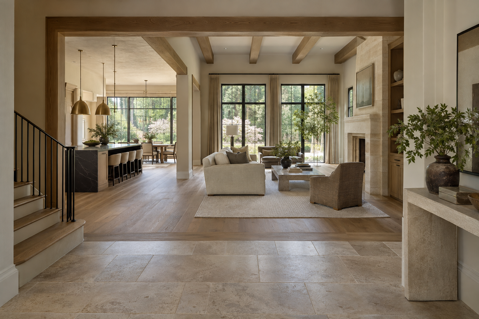
For a buyer considering a luxury new-construction residence in Charlotte, what holds the color and material palette together from room to room? A whole-home color palette depends on consistent undertones, a clear hierarchy of materials and deliberate transitions—not identical finishes everywhere. The strongest test is whether adjacent spaces feel related while still supporting different activities and moods. That relationship should remain legible through doorways, across open rooms and along the route between floors.
A Whole-Home Color Palette Begins With Relationships
A palette is more than a collection of appealing samples. It establishes which surfaces form the background, which provide warmth and which introduce contrast. Pale walls might recede, oak might connect the principal rooms, and darker metal might give doors, lighting or railings a precise outline. Each material has a role rather than equal visual importance.
Undertone is one of the most consequential relationships. Two pale stones can look compatible separately yet disagree when placed together: one may lean pink, the other green-gray. A creamy wall finish can make a cool white cabinet appear unexpectedly blue. Neither selection is necessarily wrong; the problem is the comparison created by their proximity.
Consistency does not require every surface to share one temperature. Warm limestone can sit comfortably beside deep charcoal when the contrast is deliberate. Trouble arises when several nearly matching neutrals compete without a clear reason. A distinct difference often reads more calmly than an unsuccessful attempt at sameness.
For a buyer, the useful question is not simply whether the colors match. It is whether their differences appear intentional. Look at the wall beside the stone, the cabinet beside the floor and the trim around the window. Those immediate relationships usually reveal more than a distant view of the room.
Give Each Material a Clear Amount of Space
The proportion of a material changes its effect. A dark finish on a slender railing provides definition; the same finish across a full wall becomes a dominant presence. A heavily figured stone can be compelling on one focal surface and tiring when repeated across several competing planes.
A coherent residence usually has a limited group of visually dominant materials. Secondary finishes can vary, but they should not repeatedly displace the background. If oak flooring supplies the largest field of warmth, nearby cabinetry does not need to reproduce its exact color. It may instead offer a quieter painted surface or a clearly differentiated wood tone.
Grain and pattern also carry visual weight. Broad stone veining, pronounced timber grain and patterned upholstery all ask for attention. When they share a sightline, one should generally lead while the others remain less assertive. This is a matter of scale and placement, not a rule against expressive materials.
Consider the kitchen from the adjoining living room. The island, perimeter cabinetry, floor and fireplace may all be visible at once. Their combined composition matters as much as each individual finish. A palette that looks balanced within separate rooms can become crowded when those rooms are viewed together.
Let Rooms Vary Without Losing the Thread
Continuity is often strongest when a material returns in a different role. Oak may appear as flooring in a gathering space and as cabinetry in a more enclosed room. Muted brass may recur in selected hardware rather than every metal object. The repetition establishes recognition without making the residence feel mechanically coordinated.
Private rooms can carry deeper colors or softer contrasts than public spaces. A charcoal study can belong to a pale interior if its woodwork, adjacent trim or metal details retain a connection to the larger palette. The room becomes a variation on an established language rather than an unrelated departure.
Bathrooms require particular care because tile, stone, cabinetry and plumbing finishes introduce many possible changes within a small area. They need not all use the same tile. A related stone undertone, restrained grout contrast or recurring cabinet finish can provide enough continuity while allowing each room a distinct character.
Ask what remains constant as the atmosphere changes. It might be the warmth of the wood, the treatment of painted trim or the depth of the darkest accent. If every element changes at once, the connection becomes difficult to read. If nothing changes, the residence can lose the distinctions that make different rooms useful and memorable.
Read the Palette Through Light and Surface
Color is inseparable from illumination. In Charlotte, humid daylight filtered through mature trees can feel quite different from direct sun entering an unobstructed window. A north-facing room and a west-facing room may make the same paint appear noticeably different. That variation is normal; coherence does not mean a finish must look static throughout the day.
Surface texture changes the reading as well. Honed stone scatters light differently from polished stone. Brushed metal produces a softer reflection than a highly polished finish. Even two similarly colored painted surfaces can separate visually when one is matte and the other has a pronounced sheen.
This is why physical relationships matter more than color names. A pale floor can cast reflected warmth onto the lower portion of a wall. A dark cabinet can make the adjoining stone appear brighter. Large surfaces influence one another in ways that small, isolated samples cannot fully show.
When viewing a residence, notice the palette both near the windows and deeper inside. Where possible, observe it under daylight and electric light. Ask whether the lighting changes the apparent warmth of adjacent finishes unevenly. A harmonious selection can look unsettled when nearby light sources have noticeably different color characteristics.
Check the Places Where Materials Meet
Transitions are where the palette becomes construction. The junction between wood and tile, the edge of a stone backsplash and the meeting of painted trim with cabinetry all expose how carefully separate decisions have been coordinated. Color alone cannot resolve an awkward edge or an abrupt change in thickness.
A flooring change often feels more deliberate at a doorway or another clear architectural boundary than partway across an uninterrupted space. Similarly, a wall color change needs a convincing stopping point. An inside corner, a cased opening or a change in wall plane can give that shift a reason beyond decoration.
Stairs deserve attention because they connect several views at once. Treads, risers, railings and nearby flooring should be considered together, even when they are not identical. Look from the lower floor toward the landing, then back down. The palette should make sense in both directions rather than only from one carefully chosen viewpoint.
The practical test is a slow walk through the residence. Notice what repeats, what changes and where your eye pauses unexpectedly. A well-held palette allows individual materials to be appreciated without asking you to reconcile a new set of competing relationships at every doorway.
View available residences from Peters Signature Homes, or send an inquiry about the color and material direction of its residences.
Related articles
Journal entries are general editorial writing. They are not offers, advice, or statements about any particular residence, price, availability or transaction. Imagery accompanying an entry is a conceptual visualization created for illustration and does not depict an actual property, and no residence, specification or figure described here has been verified as part of a listing.
Entity Relationship Disclosure
Peters Signature Homes, Inc. is a separate legal entity engaged in the development and sale of luxury speculative residences. Peters Signature Homes does not provide custom-homebuilding, renovation, or build-on-your-lot services.
References on this website to designers, builders, brokers, architects, engineers, consultants, subcontractors, suppliers, manufacturers, developers, lenders, communities, or other businesses identify their respective roles only and should not be interpreted as establishing a partnership, joint venture, agency relationship, guaranty, or assumption of another party's obligations unless expressly stated in a written agreement.
Each company or professional is responsible for its own services, representations, contractual obligations, licenses, insurance, warranties, acts, and omissions to the extent provided by applicable law and contract.
No company identified on this website should be considered a contracting party with a purchaser solely because it is referenced, credited, linked, or identified as having participated in the design, construction, marketing, sale, furnishing, financing, or presentation of a residence.
Company relationships · Legal disclosures · Property disclaimer